Most web designers start designing websites desktop first, mobile second. Times has changed, here's how to adapt.
This was originally from a talk by Alain Lye and Sam Suresh, moderated by Vin Lim.

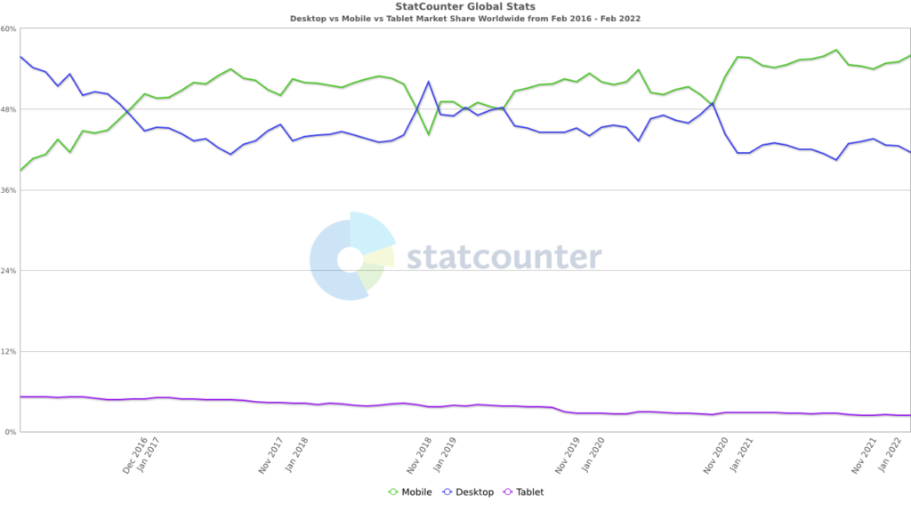
The world has shifted from Desktop to Mobile.

Evidently, people are shifting from desktop to mobile in mid of 2016. Ever since then, the trend is widening.
Everyone now carries a mobile phone. It's the simplest form of computer (browser). Those in rural areas are now keen to use mobile phones instead of desktops (due to monetary constraints).
Our attention span has also reduced from 10 seconds to 5 seconds. This means, if you are not relevant, then people leave the website as they arrive.
Since 2019, Google has also adopted mobile-first index, then proceed to index the desktop version. This means if you want to rank higher, do good on mobile.
Therefore the goal is no longer fixated on building a website for desktops, instead, it's moving towards mobile-first design.
Quick recap what you can do for your mobile.
1. Ensure it's very easy to read – The common practice is to keep it at a minimum of 16px font size. Smaller sizes deter people to read.
2. Easy to navigate – Ensure the buttons and CTAs are easy to click.
3. Make it extremely fast – People expect to load the website in 2 seconds.
4. Make it easier to use – Most menus are located at the top. Instead, Sam suggested we move the menu to the bottom of the page. More on Bottom Navigation from Material Design.

5. Remove all content-blocking elements – Elements like popups, should be removed.
6. Improve User Experience UX – Design the interactions between pages to be seamless.
7. Improve storytelling – Keep it short and simple.
There are so many things a website can do on mobile.
Among the things are ...
Learn more at whatwebcando.today.
I made a simple vibrate button below.
(Works only on Android Chrome)
Your next website should be designed with a Mobile-First approach. 55% of internet browsing are using mobile.
While the mobile browser is the most popular, don't forget desktops. In some cases, conversion happens more on desktop than in mobile device.
Whichever route you take, be inclusive.